
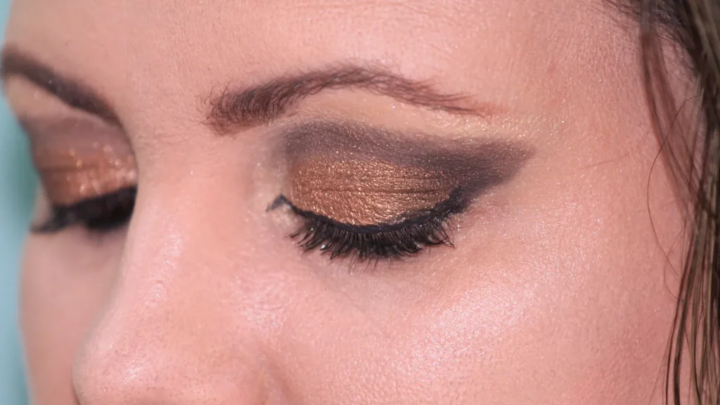
Choose the lowest-contrast Korean eyeliner color and smallest useful tip that still makes the intended mark visible. Starting with a rule such as “black is dramatic” or “brown is natural” skips what a line actually does: it creates contrast at a chosen width and location.
A useful Korean eyeliner decision therefore has two controls. Color determines how strongly the mark separates from the surrounding lashes, skin, and shadow. Tip format determines how much mark you place at once. Black, brown, and gray are not rankings from good to bad. They are different contrast settings.
Decide when the line should become visible
Before opening a shade chart, decide whether the line should be noticed before the lashes, together with the lashes, or only as a soft shadow behind them. That single question is more reliable than assigning one color to an entire complexion or “season.”
Black usually creates the strongest edge of the three. It is useful when the design needs to remain graphic at normal conversation distance, but it can also become the first thing the viewer sees. Brown and black-brown preserve a clear frame with a less abrupt jump. Gray and gray-brown can lower the visible temperature and density further, although a subtle gray may disappear when it is placed over deep shadow or a dense lash line.
These are editorial comparisons based on contrast, not promises about a formula. A pale warm brown can be less visible than a deep gray-brown; a glossy black liquid can read differently from a matte black pencil. The exact swatch, finish, and surrounding makeup still matter.
Official shade names show the range—and its limits
CLIO’s current U.S. listing for Sharp So Simple Pencil Liner names six shades: Black, Brown, Black Brown, Dark Brown, Cacao Brown, and Mute Gray. The page describes a 2 mm pencil and makes waterproof and smudge-resistant performance claims. Those claims belong to CLIO; they are not K-Trend wear-test results.
The brand’s Extreme Gelpresso Pencil Liner page takes a different route. It describes a 3 mm pencil and lists Black Brown, Deep Brown, Basic Brown, Gray Brown, Mute Brown, and Soft Brown. The names demonstrate why “just get brown” is weak advice. A shopper still has to choose depth, warmth, and grayness, and screen color cannot settle all three with confidence.
Tip width changes the decision just as much as shade. A 2 mm pencil can make short marks along the visible lash line and adjust an outer corner in smaller increments. A 3 mm pencil deposits a broader band, which can be efficient for a soft shadow but less forgiving when the goal is a hairline edge. Neither width is inherently more beginner-friendly; it depends on whether the beginner wants small corrections or fast diffusion.
Use the contrast x tip matrix
| Desired mark | Black | Brown / black-brown | Gray / gray-brown | Tool starting point |
|---|---|---|---|---|
| Crisp graphic edge | Usually the strongest contrast; verify finish | Softer but still defined | Can read smoky | Fine brush or very slim pencil |
| Everyday lash-line definition | May dominate a quiet look | Useful first comparison | Useful when brown reads warm or heavy | 2 mm pencil for incremental placement |
| Soft outer-third shadow | Can become dense quickly | Easier to diffuse visually | Often the lowest-contrast branch; verify depth | 3 mm pencil when a broader mark is intentional |
| Tiny gap-filling marks | Highest payoff per mark | Less abrupt than black | Subtle and easier to lose | Slim pencil outside the inner rim |
For a crisp graphic edge, begin with the desired contrast, then choose a tool capable of a narrow continuous line. Black gives the largest visual jump in many looks; black-brown pulls it back; gray-brown can turn the edge into part of the shadow. A liquid brush may create the sharpest point, but a slim pencil can be easier to interrupt and correct.
For ordinary lash-line definition, brown or black-brown is a useful comparison point because it can frame the eye without insisting on being the darkest element. If those shades turn too warm or visually heavy, compare a gray-brown rather than automatically moving to a lighter warm brown. For a soft outer third, a broader pencil and a lower-contrast shade may be efficient—but only if “soft shadow” was the plan from the start.
For gap-filling, the lowest sufficient contrast principle still applies. Use short, controlled marks in the visible lash-line area instead of trying to draw one thick stripe. This is a cosmetic placement suggestion, not permission to apply product to every part of the eyelid.
The waterline is a safety boundary, not extra real estate
The American Optometric Association advises against applying eyeliner to the inner eyelid rim, often called the waterline, because material can migrate into the tear film. Its contact-lens guidance separately tells wearers to follow careful makeup and removal practices, including removing contacts before taking eye makeup off.
That guidance changes how a buying guide should describe “tightlining.” Instead of treating the inner rim as a default technique, keep recommendations on the external, visible lash-line area. If a person has irritation, a diagnosed eye condition, or questions about contact-lens compatibility, product marketing and a general article are not substitutes for individualized advice from an eye-care professional.
Hygiene matters as well. Do not share eye products, and stop using a product that causes irritation. Waterproof marketing does not make a formula appropriate for sleeping, and a long-wear claim does not remove the need for gentle nightly cleansing.
Removal belongs in the color decision
A dark, crisp line can require more correction during application and more softening during removal. Read the maker’s instructions before buying, especially when the page emphasizes waterproof or smudge-proof wear. If the listing gives a strong resistance claim but no useful removal direction, decide in advance which remover in the existing routine is labeled for that eye-makeup use and whether the retailer’s return terms permit a mismatch to be corrected.
Do not test removal by rubbing harder. Give the stated cleanser time to soften the film, then wipe gently. The same principle applies during application: a broader mistake should not be “fixed” by adding more product until both sides match. Remove the unwanted section and redraw the intended width.
Do not turn black, brown, or gray into a rigid seasonal prescription. Surrounding shadow still changes how any liner color appears.
Build the eye look in the right order
Start with the element that occupies the most area—usually shadow—then add the liner in the lowest contrast that still clears the desired visibility threshold. Add mascara last so the lash density does not trick you into making the liner heavier than planned. Keep base-finish and complexion-product decisions separate; neither a liner shade name nor this matrix answers them.
K-Trend’s rebuilt OLIVE YOUNG/Sephora U.S. guide can help with retailer-channel context, but it should not replace exact-SKU checks. A family page may combine variant images, and third-party sellers may carry a different shade range than the official U.S. listing.
A familiar global name does not prove that every market sells the same formula, shades, or instructions.
At checkout, record four things: exact shade name, tip width or applicator type, resistance claim, and removal method. If one is missing, the purchase has an unresolved variable. This is especially important for brown families, where names such as cacao, mute, gray, and deep imply different results without guaranteeing how they will render on a particular screen or skin. Official copy can define a claim without becoming an independent test result.
That principle also limits waste. A buyer who needs a soft outer-third shadow may get more use from a 3 mm gray-brown pencil than from a precision black liquid. Someone drawing a fine wing may need the opposite. The category becomes easier once color and tool are treated as two separate dials.
Sources and image notes
- CLIO Sharp So Simple Pencil Liner and CLIO Extreme Gelpresso Pencil Liner: current shade names, 2 mm and 3 mm tip descriptions, and manufacturer performance language. Checked August 30, 2026.
- American Optometric Association, environments guidance and contact-lens care guidance: inner-rim and removal boundaries. Checked August 30, 2026.
- Featured photo: wilkernet, “A woman wearing Eye Shadow”, CC0 1.0. Cropped, resized, and converted to WebP; the visible wing is used only as generic contrast context.
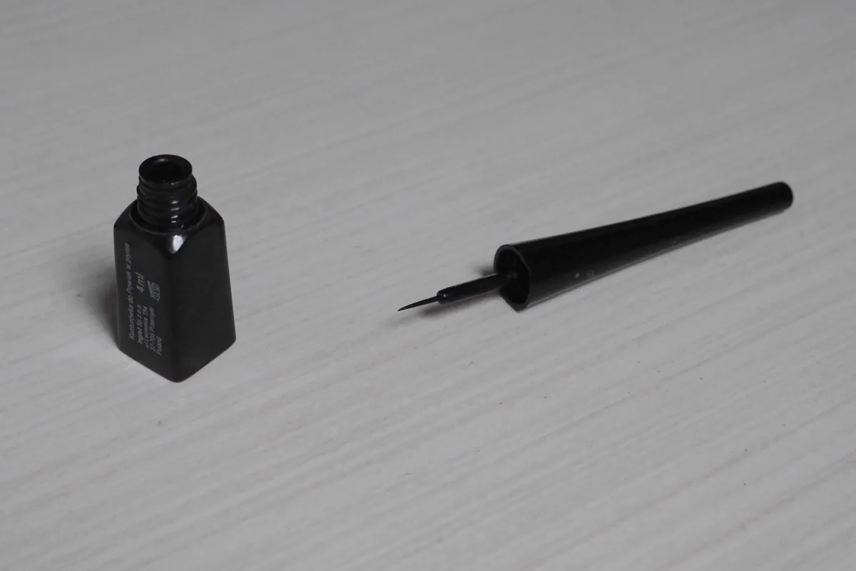
- Inline photo: Ludmiła Pilecka, “Liquid eye liner”, CC BY-SA 4.0. Resized and converted to WebP.
Method: Product pages supply shade names, tip dimensions, and brand claims. K-Trend uses those specifications to build the contrast matrix; wearer comfort varies.




.jpg)
