
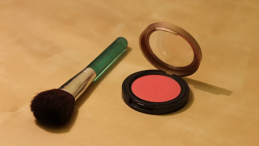
Muted Korean blush still needs enough value contrast to remain visible over finished base makeup. The problem is not always undertone: a shade can have too little light-dark separation, too little chroma for the intended look, or too little visible payoff under the lighting where it will actually be worn.
That is why “warm versus cool” cannot carry an entire Korean blush decision. Undertone may help narrow the family, but visibility depends on at least four moving parts: value, chroma, opacity or pickup, and light. A good muted shade is not the palest or grayest pan. It is the quietest shade that still shows up when the buyer wants it to.
Name the color problem correctly
X-Rite’s color education material separates three attributes that shoppers often blur together. Hue is the color family. Chroma describes how vivid or dull the color appears. Value describes relative lightness or darkness. Those definitions are more useful than treating every quiet blush as simply “low saturation” or every visible blush as “bright.”
Imagine a light beige-pink blush over a base with nearly the same apparent value. Even if the hue is flattering, the cheek may not separate from the base at ordinary viewing distance. Adding layers may increase opacity, but it may also build powder texture before it creates the desired color difference. A slightly deeper muted rose could remain just as quiet in chroma while producing a clearer value change.
The reverse can happen with a deeper shade. Strong value contrast can make a low-chroma brown-rose more visible than expected. That does not mean it is “too pigmented” in a universal sense; it means its relationship to this base and this application is different.
Brand pages describe palettes, not your finished cheek
Rom&nd’s official Better Than Cheek page presents the product as a soft powder with a silky, blurring finish and dried-fruit-inspired, watercolor-like color. The page tells users to load the brush, tap off excess, and apply to the high points of the cheeks. Its buildability and wear language are manufacturer claims, not independent evidence that every shade will stay visible on every base.
Dasique’s Blending Mood Cheek in 10 Muted Nuts is a four-pan warm, nutty, muted palette. The brand’s Cool Blending version groups four colors for cool tones. Those are meaningful descriptions of the intended palette structure. They do not establish which pan will have sufficient value contrast on an individual shopper, and they do not make a four-pan compact better value for someone who will use only one square.
This is where a palette can either solve a problem or hide it. Four related pans allow intentional mixing and small adjustments in hue, value, and chroma. But when all four occupy nearly the same visibility zone for the buyer, the compact offers variety in the pan without four distinct outcomes on the face.
Set a visibility threshold before shopping
“Natural” is too vague to be a threshold. Choose one observable result instead. Should the cheek color be visible in a normal phone photo without zooming? Should it remain subtle in indirect daylight but register indoors? Should one layer create a wash, with a second layer reserved for photographs?
| Variable | Visibility risk | Useful adjustment | Buyer question |
|---|---|---|---|
| Value contrast | A similar value can merge with the base | Move slightly lighter or deeper while keeping chroma quiet | Does the shade remain distinct from my finished base? |
| Chroma | Very low chroma can read gray or beige | Raise color clarity only as much as the intended look needs | Do I want a whisper or an obvious color event? |
| Opacity / pickup | One pass may not register | Decide whether a controlled second pass fits the routine | Is gradual buildability useful in my routine? |
| Lighting | One bulb or retailer photo can mislead | Compare indirect daylight with the usual indoor light | Have I checked daylight and my usual indoor light? |
Once the threshold is stated, use this order:
- Finish the base makeup that will normally sit under the blush.
- Estimate whether the candidate is lighter, similar in value, or deeper than that base.
- Choose the desired chroma: quiet, medium, or vivid.
- Check whether the maker describes the formula as buildable, then keep that wording attributed.
- Evaluate the shade in at least two lighting conditions before the return window closes.
If shopping online, product photos can narrow the field but should not be treated as color measurements. Camera exposure, white balance, screen settings, and surrounding colors all affect appearance. A hex code sampled from a brand image would inherit those unknowns; it would not reveal the color the powder produces over a specific base.
Use the two-light, two-layer card
The following is a method readers can perform with a product they own or are permitted to sample. It is not presented as a K-Trend laboratory result or staff wear test.
Apply one controlled pass on one cheek and two controlled passes on the other over the usual finished base. Photograph both sides in indirect daylight and in the indoor lighting used most often. View the images at ordinary phone size. Record one of three outcomes: visible at one pass, visible only after layering, or effectively merged with the base.
The method is intentionally simple. It does not produce a scientific opacity score, and the two cheeks are not perfectly identical test surfaces. Its value is decision discipline: it separates a shade that meets the buyer’s real visibility threshold from one that is visible only under magnification or unusually flattering light.
NIST explains that lighting changes how object colors are perceived and discusses the limits of broad metrics such as the color rendering index. The practical takeaway: one bathroom bulb or retailer photo cannot stand in for every environment.
Diagnose “it disappeared” before buying a replacement
If the blush vanishes after foundation, compare it on the finished base and on bare skin. A base with more coverage or a different finish can change apparent contrast and product pickup. Base finish and touch-up behavior belong to the complexion-product decision, not the blush’s undertone label.
If one layer disappears but two layers work, decide whether buildability is a benefit or an inconvenience. A controlled second pass may be exactly right for someone who fears over-application. For someone who needs reliable visibility in a rushed routine, the same formula may be inefficient.
If the shade becomes dirty-looking rather than invisible, do not assume “muted” itself is the problem. Compare hue and value separately. A gray-brown component may be more obvious as layers accumulate; a slightly clearer hue with similar value could preserve quietness without the same cast.
If cream or pot blush is the alternative, treat it as a separate formula decision rather than assuming texture will fix visibility. Official format claims cannot predict an individual result.
A four-pan palette needs four jobs
Before paying for a quad, assign each pan a role. One might be the visible main shade, one a lighter diffuser, one a deeper outer-cheek accent, and one a mixer that shifts temperature. If two pans have no distinct job in the buyer’s routine, count them as optional rather than as added value.
Online, four subtly different pans can look dramatically distinct in a close product shot. The useful question is not “Are all four pretty?” It is “Will I create at least two meaningfully different cheek results with them?”
A single pan can be the more flexible purchase when its value and chroma already clear the threshold. A palette becomes compelling when mixing solves a repeatable problem—seasonal base depth changes, different photo conditions, or a deliberate gradient—not merely because the packaging promises choice.
A shared brand or color label does not guarantee matching visible undertone or depth.
For U.S. channel context, the rebuilt OLIVE YOUNG/Sephora guide clarifies the partnership. It is not a stock receipt for either blush.
We would choose the quietest shade that remains visible in both the buyer’s usual indoor light and indirect daylight at the intended number of layers. We would choose a quad only when its pans have different jobs. That standard protects the soft effect while reducing the chance of paying for a beautiful compact that becomes beige dust on the cheek.
Sources and image notes
- Rom&nd Better Than Cheek, Dasique Blending Mood Cheek 10 Muted Nuts, and Dasique Cool Blending: official format, palette, use, and manufacturer performance language. Checked August 30, 2026.
- X-Rite, “Color Attributes: Hue, Chroma, Value” and NIST, “The Eye of the Beholder”: color vocabulary and lighting-perception limits. Checked August 30, 2026.
- Featured photo: Jen, “Blush and blush brush”, CC BY-SA 3.0. Cropped, resized, and converted to WebP; used only as generic pan-and-brush context.
- Inline photo: www.Pixel.la Free Stock Photos, “Brush-makeup-make-up-brushes”, CC0 1.0. Resized and converted to WebP.
Method: Product pages supply palette and formula descriptions. K-Trend uses them to build the visibility card; base depth, undertone, and lighting can change the result.



.jpg)
